Boo: Eat It & Be Scared
Task
I was tasked to brand an up and comming candy product aimed for kids. I created a logo and packaging desoign for each of their flavors.
Sketch
Logo
Going into to this, my main focues was that this was a kid products. so I really leaned into the kid frendly halloween imagery. I also wanted to play with the text in a fun way to get kids more intrested in the product.
Packaging
Similar to the logo design, I wanted the box to also follow the kid frednly halloween imagery. I also wanted to give each packaging a distinc design for each of the flavor.
Comps
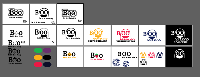
There are the comps for the logo. A couple of the sketchs I picked involved using a ghost and using the two "O" in the word "Boo" as eyes. Another idea I picked from the sketch was using little mini halloween images in the text of boo. And the last idea was creating a ghostly effect around the text.
The color I wanted to use was haloween colors like orange, black, blue, and red.
Final
Logo
Primary
So, for the final logo desgin, I went with the ghost logo because it fits the aesthetic with I was going and creates a character tht kids would like. I stuck with a black and white because it would be mmore flexiable to put it on different color backgrounds which will come in handy when it comes to putting the logo on different packaging.
Secondary
These are the secondary logo that hight lights the mascot for the product.
Mockups

These are the mockups for the packaging design. Each desgin represents the different flavors.